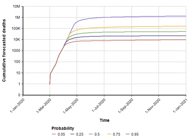
Two weeks ago in the article “Estimating US Deaths from COVID-19 Coronavirus in 2020” [C20b], I developed a probabilistic forecast for the number of people in the US who will die from COVID-19 during the year 2020. A lot has happened with the COVID-19 epidemic in the intervening two weeks, and many people have asked me to update the forecast. Thus, before diving into today’s blog, I’d like to present my current running forecast for the number of deaths in the US from COVID-19 that will occur during the year 2020.
Please refer to the original posting for information on my forecasting methodology, the precise specification for what is being forecasted, and other background information. In the final section of this posting I discuss the adjustments to the forecast.
In today’s blog posting, I’ll be discussing
- Mitigation, known popularly as “flattening the curve”, doesn’t work.
- Current US Covid-19 trends – we are in the exponential growth phase.
- The log-Y scale axis: A simple but invaluable tool for understanding what is happening.
- The triangle suppression model: A really easy but powerful conceptual tool for understanding how and when the epidemic will end.
- A triangle suppression model with uncertainty: A novel modeling approach for understanding when our economy returns to normal.
- What happens if the US doesn’t adopt a suppression strategy? — The dire age-stratified ICF prediction.
- The latest update to my running forecast.
Mitigation failure
Last Monday the Imperial College COVID-19 Response Team [IC20] released an influential report showing results they obtained from their quantitative models of COVID-19 spread in the US and UK. Their results focus on the demands that will be placed on our health care systems as the pandemic progresses, and the degree to which various levels of social isolation can help. A couple of conclusions from that report are really important. Taking no social isolation measures is dire, and would overload our health care system at roughly 20-times its capacity. The strategy of mitigation (or “flattening the curve”), which has dominated the national dialog, isn’t a viable option. The idea behind mitigation is to adopt moderate social isolation measures so as to slow the rate of cases to a level that doesn’t exceed our health care system’s capacity. The following graph from that report compares intensive care unit capacity in the UK to the projected need as various social isolation measures are adopted.
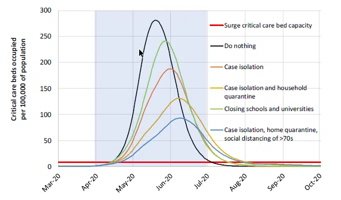
Shockingly, the horizontal red line on this graph is the health care system’s ICU capacity. Although this is for the UK, apparently the situation is pretty similar for the US. In their simulations, the curves for the US are shifted to the right in time by about 10 days. Even when all the listed measures are enacted, with various levels of compliance assumed, a mitigation strategy doesn’t get us to the general ballpark of where we need to be. The alternative to a mitigation strategy is a suppression strategy, in which stronger measures are taken for a shorter period of time in order to reverse the exponential growth to an exponential decay in the number of new cases.
Exponential growth phase
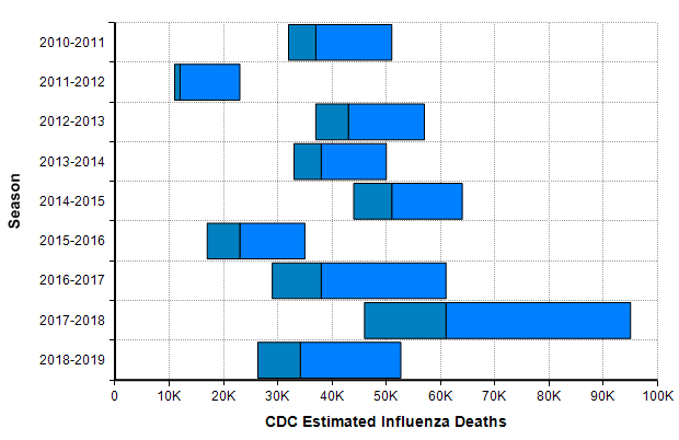
As of today (23-Mar-2020), the US has only 483 deaths reported due to COVID-19 [W20a]. While every death is a tragedy, this hardly compares to the number of people who die every year in the US from the seasonal flu, which numbers in the tens of thousands every year.
This leads many people to conclude that there has been a horrible and economically catastrophic overreaction to the outbreak. The flaw with that conclusion comes from an under appreciation for exponential growth. Right now in the US, the numbers of reported cases as well as the number of reported deaths from COVID-19 are both following a classic exponential growth curve, with reported cases increasing 36% per day and total deaths increasing 22% per day.
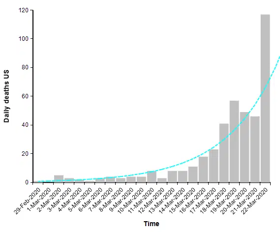
When you are dealing with an exponential process, whether exponential growth or exponential decay, it is very helpful to plot the graph using a log-Y scaled axis. The same graph above with a log-Y axis becomes
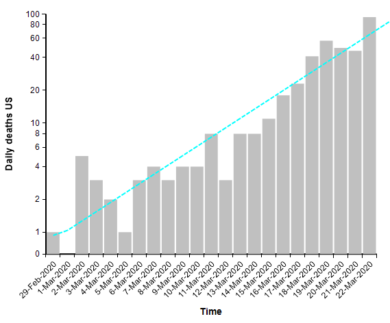
The log-Y scale turns an exponential curve into a straight line, and thus makes it easy to extrapolate the trend into the future. The next graph shows the total number of deaths in the US, where actual data points for each day appear as red dots. They form a pretty straight line when plotted with a log-Y axis, making it easy to extrapolate the blue line through them.
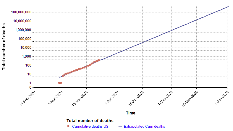
The log-Y plot makes it easy to see that at the current rate of increase, the number of deaths shoots past flu season levels in less than one month from now, and in fact passes the entire population of the US by June 1st. Of course, it is not possible for the growth to continue indefinitely — eventually we run out of susceptible people — but the important point is that the use of a log-Y plot makes it possible (and easy) to extrapolate. I’ve chosen to plot number of reported deaths, instead of reported cases, because reported cases reflects a combination of how much testing is taking place with the actual number of cases, and there is no easy way to separate the two. The downside of using the number of deaths is that it is a lagging indicator, since people have the disease for some time before they die. A primitive way of compensating for a lagging indicator is to shift the entire graph left by the lag time. To determine how much to shift, I found five articles that have estimated the time from symptom onset to death for COVID-19, with mean estimates of 12.5 days, 18 days, 15.2 days, 13.8 days, and 11 days (from the Hubei graph) [WM20, C20b]. So from these, let’s say it takes roughly two weeks from infection to death (erring on the conservative side). Here I shift the plot left by 14 days to get a rough idea of the number of people who already had and would eventually die from COVID-19 at each given date.
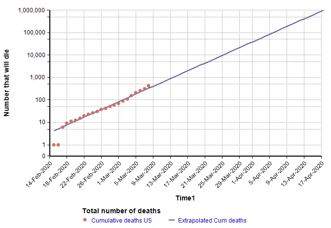
On the lag-shifted graph, the blue line crosses 6,484 on 23-Mar-2020 (today), which gives a rough idea of the number of people in the US who already have the disease and will eventually die from it, based only on the current trend and the estimated lag of 2 weeks from infection to death. Hence, it is a fair conclusion that the numbers today are already into the flu season range. Unfortunately, on top of this we have 284 days still remaining in 2020.
Just as exponential growth becomes a straight line with a log-Y scaled axis, so does exponential decay. Exponential growth is a straight line with a positive slope, whereas exponential decay is a straight line with a negative slope.
Suppression strategy
When COVID-19 first hit Wuhan city in Hubei province, the cases and deaths expanded initially in a classic exponential fashion (see The mortality rate of the Wuhan coronavirus) to a peak of 150 deaths per day, but then after a series of unprecedented lock down measures had time to take effect, the trend reversed so that the number of deaths each day decayed exponentially.
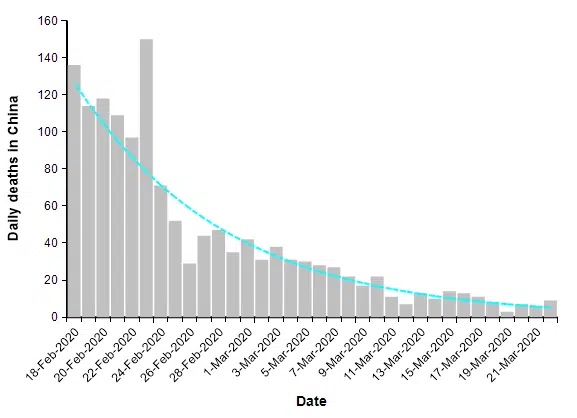
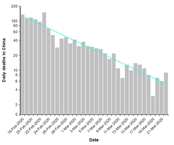
The number of reported deaths from COVID-19 over the entire country of China has been under 20 people per day for two weeks. This is what a successful suppression strategy looks like. When we plot this same data on a log-Y axis, it becomes a straight line.
The suppression triangle
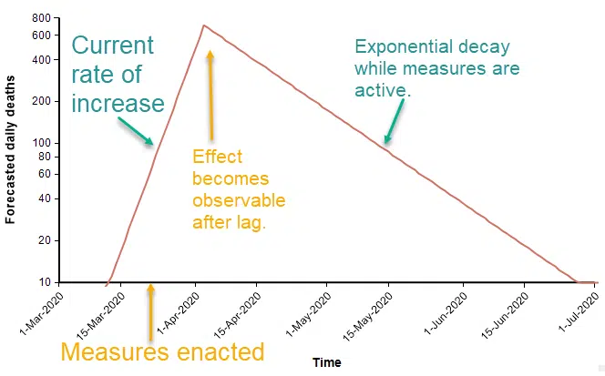
The fact that both exponential growth and exponential decay are both straight lines in a log-Y plot leads to a constructive way to visualize a suppression strategy. Before sufficient measures to curb the spread are adopted, exponential growth appears as straight line with a positive slope. At some point in time, strong measures begin (analogous to the lock down of Wuhan city in Hubei province). At that moment, the number of people contracting the virus starts to fall, and two weeks later that decline appears as a reversal in the daily death rate. The decline is an exponential decay. In the diagram above, the rate of decay is 1/2 the original rate of increase, so that it takes twice as long to bring the numbers down as it took for the numbers to increase originally.
Epidemiologists characterize infectiousness using the reproduction number, R, which is the number of other people that one infected person transfers the virus to. When this is greater that 1, infections grow exponentially. When it is below 1, infections decay exponentially. So when R changes just a little, from greater than 1 to less than 1, the behavior changes from a rapid increase to a rapid decrease. In a log-Y plot, the slope of the line captures the speed of the response, which is not in the same units of measurement as R, but provides similar information. The beauty of the suppression triangle is that you can determine very easily, without any sophisticated simulation, how long the recovery will take.
To predict how long the recovery will take, you need to estimate the slope of both lines in the triangle. You can express the slope either as a natural logarithm, ln(deaths)/day, or as a base-10 logarithm, log10(deaths)/day. To convert a ln(deaths) to a log10(deaths), divide by 2.3. I generally prefer to use natural logarithms.
The current trend for number of people dying daily in the US from COVID-19 has slope of 0.20 in natural logarithm units (or 0.086 in base-10 units). The slope of ln(deaths) during the recovery in China has a slope of -0.10 in natural logarithm units (or -0.043 in base-10 units). This means that if the measures we enact in the US are as effective as they were in China, the duration that we need to remain in “lock down” is twice the elapsed time that we were in growth mode. Furthermore, and perhaps even more important, for each one day that we delay the implementation of necessary measures, two days of lock down will be required. But this is only if our measures are equally effective as China’s measures were.
It seems unlikely that the US would be able to enact measures as strong as China’s, since China was able to mandate lock downs that would be viewed as undemocratic here. If the US is instead able to achieve a decay slope of -0.05, half the rate of China, then recovery would take 4 times longer than our growth phase, and each day delayed in taking strong action translates into 4 extra days of lock down. You can reach these conclusions simply by drawing the suppression triangle.
There is a huge economic cost to the measures necessary to achieve suppression. It seems evident that a big investment to make the suppression slope as steep as possible would pay off in droves, allowing the economy to return to normal, or almost normal, much sooner.
What happens after the suppression phase?
At the end of suppression, we relax most of the economically disruptive measures and attempt to return to normal. At this point, the number of cases and number of daily deaths from COVID-19 has been reduced to a tolerable number. But the challenge now is to prevent exponential growth from taking hold again.
The Imperial College report [IC20] suggests that we would need to periodically re-engage suppression measures as number of cases starts to climb again, repeating an on-off cycle for the long term. However, I am a bit more optimistic that we will be able to maintain stability without having to re-impose economically disastrous suppression measures.
To achieve stability after suppression ends, the first component required is a stellar testing and detection infrastructure. The US is currently deficient in its COVID-19 testing capabilities, so to stabilize the post-suppression stage, much progress has to occur between now and then. The case counts will be low, so that when new cases are detected, it should feasible to do thorough contact tracing to stomp out the small fires before they start raging. We will need an ample supply of high quality masks, not just for health care workers, but for everyone, and we will all need to wear them when in public. We may still need restrictions on large gatherings, and some additional practices to keep social contacts low enough that the overall reproduction number stays below 1.
A triangle suppression model with uncertainty
I find it useful to model the epidemic in different ways. Each method of modeling yields new insights. Some methods are better for certain things than others. The suppression triangle at the level I’ve described it qualifies as a “model” — it is a simplified representation of a complex system that yields useful insights and predictions. At the level I’ve described it, you can “implement” this model with a straight-edge, pencil and paper, without having to even touch a computer. However, I realized I could build upon the idea to create a new way of modeling the progression of this epidemic.
The core idea behind the model is the simplifying assumption that a suppression strategy is the only viable exit we have, and therefore, we will have to adopt it sooner or later. There are two key unknowns, which might be viewed either as decisions or uncertainties depending on who you are: When will effective suppression start, and how effective will it be? In the model I created, I can treat either of these as a decision (where you can select the date or level) or as an uncertainty (a probability distribution). To decide when the suppression stage is lifted, there is also a policy decision where you select what number of daily deaths is tolerable, and it assumes that in the post-suppression phase, the disease is stable at that level through the end of the year 2020.
One of the simplifying assumptions is that there is a single day when the “effective” suppression measures kicks in and forces R<1. It is possible this may have happened already with the numerous school closures, event cancellations, and shelter-in-place orders around the country. There is a lag (which is also an uncertain variable in the model) between when the effective measure kicks in and when we are able to detect the effect. The single day transition assumption would be violated if we end up taking additional measures little by little. The effect of each additional measure would be to reduce the slope a bit more, but without doing enough to make it negative. This type of strategy would slow growth, but prolong the duration of disruptive measures compared to the duration obtained with the simplifying assumption. However, the violation of the assumption may be offset in the model somewhat by the fact that I am able to model the date of action as a probability distribution.
I’m going to show some results from the model. To obtain the first set of results, I assume
- The effective date of implementation of suppression measures was 21-Mar-2020
- The recovery slope, ln(daily deaths)/day, is uncertain but uniformly distributed between 0 (stable) and -.1 (the rate of recovery observed in China).
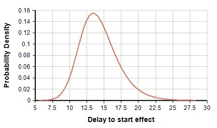
- The lag time between the implementation of suppression measures and its effect showing up in the daily deaths count follows the distribution UncertainLMH( 11, 14, 18, lb:2, ub:30 ), shown here

- The post-suppression level of daily deaths is maintained at 10 deaths per day.
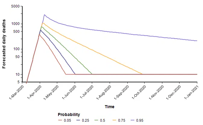
With these, the following probability bands graph shows the number of deaths per day over the remainder of the year. The different lines reflect the range of uncertainty. At any given date, it forecasts a 90% probability that the true value lands between the 0.05 and 0.95 bands, a 50% probability it lands between the 0.25 and 0.75 lines, with the green line denotes the median projection.
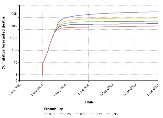
The cumulative (total) number of deaths, shown as a probability bands plot, is shown here.
The PDF and CDF for the total number of deaths by the end of the year (given that effective suppression measures started on 21-March) are as follows.
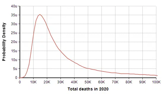
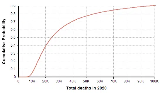
In this scenario in which decisive action was taken two days ago (21-Mar-2020), the model forecasts a mean of 44,790 deaths, a median of 24,420 deaths, and a 90% probability that number of deaths in the US is under 100K. The date on which the suppression phase ends is also uncertain (due to the uncertainty in the rate of recovery), as shown here
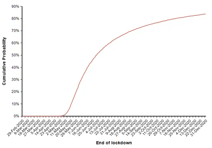
The actual number of deaths in this scenario is fairly encouraging, with the number of deaths kept within typical flu season numbers, but this last graph showing the date at which measures are lifted is somewhat discouraging.
Next, I show a second run that uses the same assumptions with the exception that the date in which suppression measures are enacted is changed from 21-March to 4-Apr-2020. The model’s prediction for the cumulative number of deaths increases quite a bit.
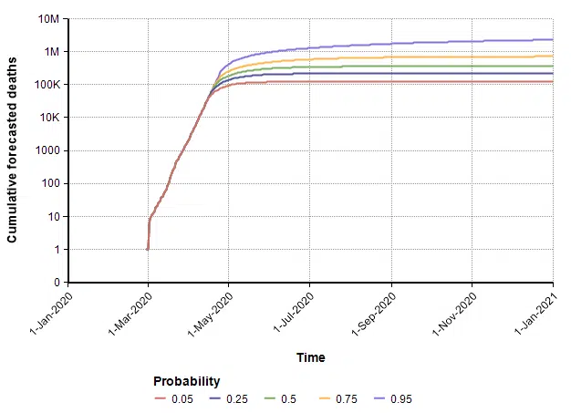
Since every model makes simplifying assumptions, the scope over which the results are reasonable is typically limited. The assumption in this model that exponential growth continues up to the point of action begins to break down when the reservoir of susceptible people becomes a bottleneck, which likely occurs when the number gets near the 1M range and above. So the 0.75 and 0.95 bands in the above plot should probably not be taken too seriously.
In this case (in which measures start on 4-April), the forecast for when the suppression stage ends is shown in this CDF plot.
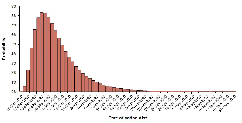
Finally, I can evaluate the model using a probability distribution for the date of action. This simulates the case where we are uncertain about exactly when an effective suppression policy starts. I use the following distribution on this start date.
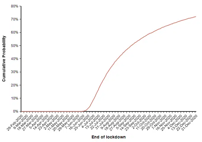
With this uncertain start date, the following probability bands plot shows the cumulative number of deaths in the US.
In this uncertain case, the end of the suppression phase is projected to have a median date of 7-July and a mean of 2-July.
Model Limitations
This triangle suppression model represents a novel way of modeling the progression of the outbreak. Its virtue is its simplicity, but the simplifying assumptions also limit its scope. The core assumption is that the US will eventually have to implement a suppression policy, it is just a question of when and how strongly. Also, it models both sides of the suppression triangle as exponential growth and decay, which breaks down once the growth extends too far, to the point where the reservoir of susceptible people starts to decrease substantially. This likely starts becoming a bad assumption when the number of deaths is somewhat shy of 1M. It also approximates the growth and decay as single rates, whereas it is more likely that a series of separate measures will bend the curve a little at a time, creating a convex suppression polygon instead of just a simple triangle.
Another limitation comes from the fact that I’ve modeled the entire US as a single system. An interesting extension of this approach would be to subdivide the country into several regions, which might have different growth rates and suppression periods. New York may require more severe and longer lasting suppression measures than the more sparsely populated and less infected New Mexico, for example.
Downloading the triangle suppression model
The triangle suppression model is open source. You are free to download it, change it, and do as you wish.
To use the model
- Install Analytica free trial (if you don’t already have Analytica installed)
- Download the model
- Launch Analytica, select Open Model and select the downloaded model file.
From the Free 101 edition of Analytica, you can evaluate all results, change inputs and re-evaluate results, and browse all parts of the model, but you won’t be able to modify or extend it. To extend the model you will need at least Analytica Professional.
If suppression doesn’t occur
What happens if we don’t implement strong enough measures in the US to suppress the outbreak? In this case, because exponential growth is so fast, the disease will saturate the population. This is what people mean when they say “everyone will get it”. But does that mean 10% of everyone gets it, 50%? or literally 100%?
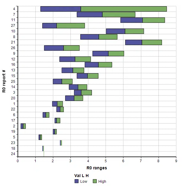
There is a reasonable argument to be made that the percentage of the population who actually contract it in full saturation would be 1 – 1/R0, where R0 is the basic reproduction number that characterizes how many other people one infected person transfers the virus to when no one else in the population is immune. However, R0 is not just a property of the virus, but is also a property of our own behaviors. I pulled the following estimates of R0 for COVID-19 (and their stated range of uncertainty) from 27 recently published or posted papers:
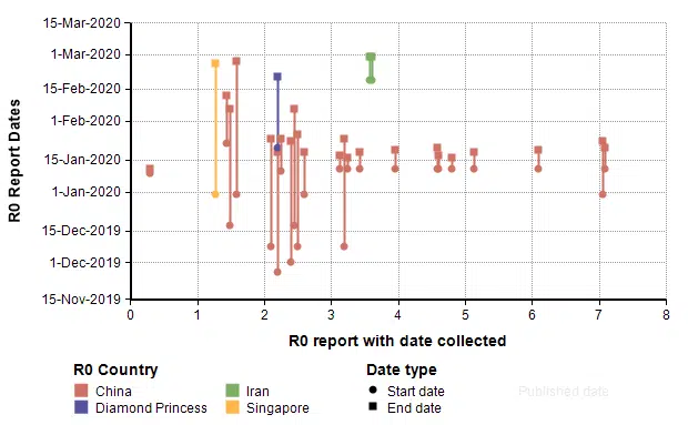
We might also reason that the more recent studies are more likely to be more accurate, so I plotted this same data showing the start and end dates for the data collected in the study.
By comparing to those studies, it seems plausible that the R0 value for the US for the remainder of the year may be around 1.5 to 2, which would imply that between 33% and 50% of the population would contract COVID-19.
Once we know the number of people who contract it, the critical value needed for predicting the number of deaths is the Incidence Fatality Rate (IFR). This is the fraction of people who die among all people who contract the virus, whether officially recorded or not, diagnosed or not, and symptomatic or not. This critical rate is difficult to estimate without more systematic testing, since at present we have very little idea how many people are asymptomatic or simply haven’t bothered to seek medical attention because their symptoms are mild. You have most likely encountered a related number, the Case Fatality Rate (CFR), which is the fraction of people who die among those actually diagnosed with the disease. This one is directly observable but over-estimates the actual fatality rates.
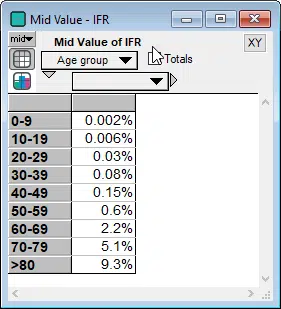
The Imperial College report [IC20] gives the following IFR estimates
It is important to also note that the IFR rate depends heavily on whether the critical care (ICU) system is operational or overwhelmed. A comparison of CFR rates between countries like Italy and Iran whose ICU systems are overwhelmed, to those of South Korea and China outside Hubei suggest that IFR rates are likely to quadruple in an overwhelmed critical care system compared to a fully functional system.
Using the actual population of people in each age category in the US, assuming that 33% of all people in all age categories contract it, and using the IFR numbers from the Imperial college report (without increasing them to reflect an overwhelmed ICU system), the following graph shows the expected number of fatalities in each age group.
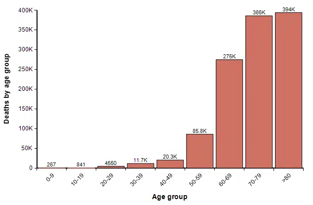
The total here is 1.2M. In the coming weeks, I believe we will see much better estimates of IFR published. To some degree, this gives a sense of the worst case. However, at this level, ICUs would be overwhelmed and many people with non-COVID-19 related illnesses that require ICU care would lose access to that care and die. Although I have only attempted a rough back-of-the-envelope analysis, I think that number of increased collateral deaths could actually end up exceeding the number of deaths from COVID-19.
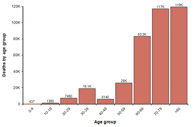
One other possibility, however, is that we reach 33% saturation, but where the percentage of people who get it in each age group is highly skewed toward younger people. For example, if 54% of people under 40 contract it, but only 10% over age 40 do, then 33% of the full population will have contracted it, but the number of deaths by age would be 380K, roughly one-third of the previous graph, distributed as
Updating my running forecast
In a blog posting that I published two weeks ago titled Estimating US Deaths from COVID-19 Coronavirus in 2020 [C20b], I undertook the very challenging task of forecasting the number of people who will die from COVID-19 related disease in the US in the year 2020. The article is mostly about how to create a forecast, in which I used the morbid metric as an example to illustrate best practices. The article contains a lot of material about the approach, the precise definition of what is being forecast, an introduction to probability distributions and probabilistic forecasts, the pitfalls of cognitive biases, the important of starting with base-rate data, data on causes of death in the US, data from previous pandemics, influenza and pneumonia, and basic models. From that effort, I arrived at a probabilistic forecast for how many people in the US will die from COVID-19 in 2020.
A lot has happened with the COVID-19 pandemic, and a lot has been learned about the virus and epidemic in the two weeks since I published that forecast. Several people have requested that I publish an update to that forecast.
One of the principles that I advocate is to explore the same forecast with different modeling approaches. When you rely on a single model, it is easy to anchor on the model itself, placing too much faith it its results. Different models with different approaches, each based on different types of simplifying assumptions, help to expand your thinking as to what is possible. In the current article, I explored the triangle suppression model, as well as an age-stratified maximally simplistic model. The triangle suppression model is, I think, one of the best approaches for understanding the most optimistic scenarios. The age-stratified analysis is good for thinking about the worst case. In my article, How social isolation impacts COVID-19 spread in the US: A Markov model approach [C20d], I explored a dynamic Markov model of the disease progress contributed by Robert Brown, and in the original blog posting [C20b] I explored a maximally simplistic model and an SCIR-type dynamic model.
I’ve also been searching for similar forecasts that have been published by other people. A key distinction is that the quantity that I have chosen to forecast, the number of US deaths from COVID-19 in 2020, projects where we end up after adopting whatever unknown measures we implement as a society. This is a lot harder than forecasting what would happen in the absence of any measures, or if certain known measures are taken. One of the few directly comparable estimates appeared in a New York Times article [SF20], where several experts estimate that the number of deaths would be between 200,000 and 1.7M, with one expert (Dr. James Lawler from Univ. Nebraska Medical Center) estimating 480,000 deaths. These estimates were based on data available at the end of February, and substantially overlap by 10-Mar-2020 forecast, although are slightly more pessimistic. My updated forecast is a bit closer to these compared to my 10-Mar-2020, although I haven’t shifted my newer forecast to be quite as pessimistic.
Using a log-X axis, as I did in my original article, my updated forecast compares to my forecast of 10-Mar-2020 as follows.
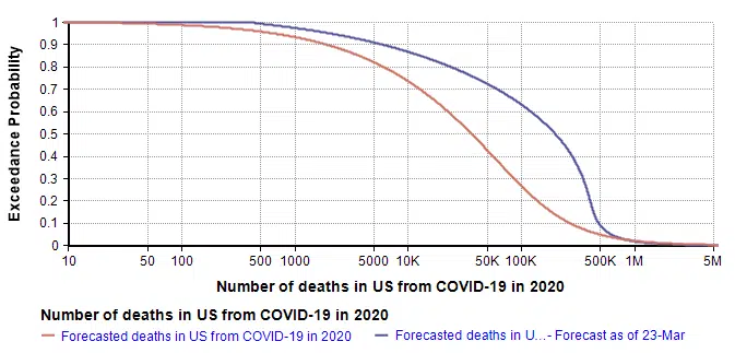
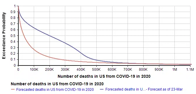
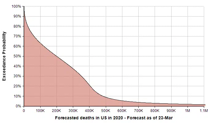
The quantiles that define the new forecast are: lower-bound=419 (current death count), 10th=6K, 25th=40k, 50th=200k, 75th=380K, 99th=1.5M. I used a 7-term Keelin distribution fit to these quantiles. The mean estimate is now 266K (compared to 167K in the 10-Mar forecast).
The greatest changes have occurred on the optimistic end of the forecast, which is most visible in the log-X plot. I think it is natural for the left side of the forecast to be most directly impacted by the observations of the previous two weeks. That, combined with the triangular suppression model, establishes a new and slightly degraded best case. My right tail has not changed much since I haven’t really obtained any insights about the worst case that I didn’t already have two weeks ago.
Methods and Tools
All models, analyses and Monte Carlo simulations in the work reported here were built and carried out in the Analytica software by Lumina Decision Systems. All original graphs (i.e., every graph except the first one that was taken from [IC20]) were plotted in Analytica. The SnagIt editor by TechSmith was used to add annotations the triangle suppression diagram.
Summary
The recent Imperial College report [IC20] builds a compelling case that a suppression strategy is our best approach and perhaps only approach to ending this pandemic and returning to normal economic conditions. I introduced the triangle suppression concept as a simple way to visualize a suppression strategy and to understand how long the suppression stage will have to last. By introducing explicit representations of uncertainty, I came up with a new approach to model the progression of the pandemic, built on the assumption that a suppression strategy is the only option and therefore will eventually be adopted, with the only question being when and how strongly. Finally, I updated my running forecast for the number of US deaths from COVID-19 that will occur in the year 2020.
References
- [C20a] Lonnie Chrisman (2-Feb-2020), “The mortality rate of the Wuhan coronavirus“, blog posting on Analytica.com.
- [C20b] Lonnie Chrisman (10-Mar-2020), “Estimating US Deaths from COVID-19 Coronavirus in 2020“, blog posting on Analytica.com.
- [C20c] Lonnie Chrisman (14-Mar-2020), “Could this be the most impactful graph ever?“, Facebook blog posting.
- [C20d] Lonnie Chrisman (19-Mar-2020), “How social isolation impacts COVID-19 spread in the US: A Markov model approach“, blog posting on Analytica.com
- [CDC19] Kenneth D Kochanek, Sherry L. Murphy, Jiaquan Xu, and Elizabeth Arias (2019), Deaths: Final data for 2017, National Vital Statistical Reports 68(9), U.S. Department of Health and Human Services, CDC.
- [CDC20a] Disease burden of Influenza, Center for Disease Control and Prevention, website.
- [F20] Mike Famulare (19-Feb-2020), “2019-nCoV: preliminary estimates of the confirmed-case-fatality-ratio and infection-fatality-ratio, and initial pandemic risk assessment“, version 2.0, Institute for Disease Modeling.
- [IC20] Neil M Ferguson, Daniel Laydon, Gemma Nedjati-Gilani, Natsuko Imai, Kylie Ainslie, Marc Baguelin, Sangeeta Bhatia, Adhiratha Boonyasiri, Zulma Cucunubá, Gina Cuomo-Dannenburg, Amy Dighe, Ilaria Dorigatti, Han Fu, Katy Gaythorpe, Will Green, Arran Hamlet, Wes Hinsley, Lucy C Okell, Sabine van Elsland, Hayley Thompson, Robert Verity, Erik Volz, Haowei Wang, Yuanrong Wang, Patrick GT Walker, Caroline Walters, Peter Winskill, Charles Whittaker, Christl A Donnelly, Steven Riley, Azra C Ghani (16-Mar-2020), “Impact of non-pharmaceutical interventions (NPIs) to reduce COVID-19 mortality and healthcare demand“, Imperial College COVID-19 Response Team.
- [JAL20] , , , , , , , , “Real time estimation of the risk of death from novel coronavirus (2019-nCoV) infection: Inference using exported cases“, MedRXiv, doi: https://doi.org/10.1101/2020.01.29.20019547.
- [LKY20] Natalie M. Linton1, Tetsuro Kobayashi, Yichi Yang, Katsuma Hayashi, Andrei R. Akhmetzhanov, Sung-mok Jung, Baoyin Yuan, Ryo Kinoshita, Hiroshi Nishiura, “Epidemiological characteristics of novel coronavirus infection: A statistical analysis of publicly available case data“, medRxiv preprint doi: https://doi.org/10.1101/2020.01.26.20018754.
- [SF20] Sheri Fink (13-Mar-2020), “Worst-Case Estimates for U.S. Coronavirus Deaths“, New York Times.
- [TP20] Thomas Pueyo (19-Mar-2020), “Coronavirus: The Hammer and the Dance What the Next 18 Months Can Look Like, if Leaders Buy Us Time“, medium.com.
- [MN20] Midas network GITHUB repository of COVID-19 parameter estimate sources.
- [W20a] Worldometers.info (23-Mar-2020), “Coronavirus: US“
- [WM20] Zunyou Wu and Jennifer M. McGoogan (24-Feb-2020), “Characteristics of and Important Lessons From the Coronavirus Disease 2019 (COVID-19) Outbreak in China Summary of a Report of 72 314 Cases From the Chinese Center for Disease Control and Prevention“, JAMA. Published online February 24, 2020. doi:10.1001/jama.2020.2648.