In this posting, I am taking on the morbid challenge of forecasting how many people in the US will die from the COVID-19 coronavirus in the year 2020. This is one of many uncertain variables that are directly relevant to the decisions many people and organizations are facing at the moment.
I’ve assessed many quantities in my modeling career, and this one ranks among the most challenging for many reasons. However, it is not fundamentally different from the smaller assessment challenges any builder of decision models faces many times a day. In fact, I view it as a great example to teach you some of what I’ve learned about how to approach a forecasting or assessment challenge like this. Also, since I’m aware that publishing my estimate could have substantial ramifications, I want to take you through my full assessment process so that some of you can critique, criticize, adjust, poke holes in, and otherwise rip to shreds my estimates. If you aspire to be a “super-forecaster” [TG15], I strongly invite you to follow similar steps to obtain well-reasoned estimates, which could very well differ from mine.
You may have a first impulse to come up with your own guess before you read further. I would like to implore you to avoid that impulse. I will be covering the topic of anchoring [TK74], one of the hardest biases to overcome as you start an assessment.
If you only care about seeing my forecast, jump to the Results section. But I hope you don’t because this is fundamentally an article on how to approach a challenging forecasting problem to get accurate results.
Defining the assessment problem
Your first step in an assessment should always be to specify clearly and unambiguously exactly what quantity you are estimating. Decision analysts like to invoke the clairvoyant (or clarity) test [MH90 p.50, H88], which stipulates that two hypothetical clairvoyants, who both can perfectly see the future, would agree on the outcome or value of the quantity.
For my present challenge, the assessment of the number of deaths from COVID-19 in the US in 2020, do you see any potential ambiguities? The primary source of ambiguity revolves around which deaths should be counted. Location and time are fairly clear: we are considering human deaths that occur within the 50 US states and 5 US territories between 1 Jan 2020 and the 31 Dec 2020 in the time zone where the death occurs. Somewhat more difficult is agreeing on when to consider the COVID-19 virus as the cause of death, especially when you consider that those who are already gravely ill are the most at risk. Someone in that category may have died anyway, even if they hadn’t contracted it. A good criterion would be to say that the death certificate, as registered with the National Center for Health Statistics (NCHS), should list the underlying or contributing cause of death as COVID-19 or from COVID-19 complications. Another potential ambiguity arises because the virus, like any other virus, is actively mutating [NS20], so at some point, a descendant virus might be reclassified as a different infection. In the event that happens, I’ll include all descendant viruses.
Although these fine distinctions will have minimal, if any, impact on my assessment process at the granularity that is possible with this assessment, a primary benefit of being this precise upfront is that it makes it possible next year to evaluate how I did. I picked the criteria I did precisely because the US Centers for Disease Control uses these same criteria on their annual Summary of the Influenza Season [CDC18], so next year we can compare to their reported numbers. I look forward to conducting a critical review of my logic in this assessment a year from now, and learning from it.
Being explicit about uncertainty
When you create a forecast, it is really important that you come up with a probability distribution and not just a single number. If you are forecasting a binary event — whether something will or will not happen — then your forecast should be in the form of a probability (or equivalently, betting odds [A19]). The value of your forecast is greatly diminished if all you do is produce one guess. For example, if you were to send me a prediction that the S&P 500 index will close the year at 2,900, as an investor I would find this virtually useless. But if you provide me with a distribution, and I believe you to be a well-calibrated forecaster, I can now use that to make rational decisions. It tells me your confidence, and how probable less likely outcomes are.
Introduction to probability distributions
If you are already comfortable with probability distributions, you can skip ahead to the next section. If you are scared away from probability distributions because you have no background in statistics, your anxiety is misplaced. Nowadays, you can makes use of distributions in your own decision making, and even create your own, without even knowing what a Normal distribution is, thanks in part to the availability of easy to use modeling software, such the tool I work on, Analytica [A20]. One way to present a probability distribution for a numeric quantity (such as the one I’m forecasting in this article) is as a cumulative distribution function, or just CDF, or just probability function, such as the following.
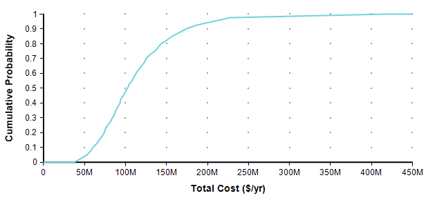
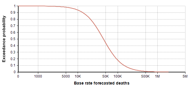
Each point of the curve gives the probability (from the Y-axis) that the actual total cost will be less than or equal to the value on the X-axis. So, for example, in this plot, there is an 82% chance that the total cost will turn out to be less than or equal to $150M (= $150,000,000). You can equivalently say that there is a 18% chance that the total cost will exceed $150M. As alternate way of plotting the exact same graph is to flip it in the Y-axis, which is known as the probability exceedance plot.
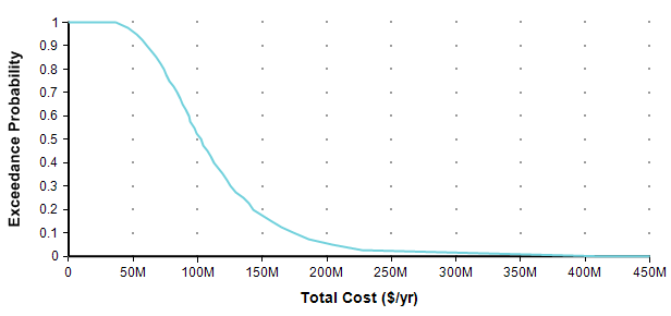
Each data point on the plot is the probability from the Y-axis that the actual value will be equal to or greater than the value on the Y-axis. Now you can discern that there is an 18% chance of exceeding 150M, you don’t have to subtract 82% from 100%. CDF plots are more common, but exceedance plots have an advantage when you care about very rare but high-cost events in the right tail. For example, suppose you care about the really rare cases that occur only 0.01% of the time. You can’t see these on either of the above plots because it becomes less than one pixel from the axis, but you can see these quite well if you use a log-scaled Y-axis.
When you want to express your own forecast as a probability distribution, how do you do it without having any background in statistics?
What you need to do is decide on three (or more) percentile predictions. The most common convention is to use 10-50-90, denoting the very low-end outcome, the middle outcome, and the very high-end outcome. In the total cost example, you may have come up with that distribution be estimating that there is a 10% chance the actual cost will be less than $61M, a 10% chance it will exceed $170M, and an equal chance it will be less than or greater than $100M. With these three numbers, you can specify the full distribution in Analytica by setting the Definition of Total_cost to
UncertainLMH( 61M, 100M, 170M )
When you show the result, and select either CDF or Exceedance probability views, you get (approximately) the above graphs. It is that easy. (Caveat: The exceedance probability view is new in the Analytica 5.4 release). There is one further consideration, however. This distribution we just specified allows negative value outcomes. In this example, they occur at very low, but non-zero probability, in other cases they may come out as more likely. So when negative values are nonsensical, you can also include a lower bound:
UncertainLMH( 61M, 100M, 170M, lb:0 )
When estimating a proportion of frequency, you should use a lower bound of 0 and an upper bound of 1 by adding ub:1. In the present article, I start out estimating 25-75-99 percentiles instead of 10-50-90, and eventually refine this into an even more nuanced 10-25-75-99, along with a lower bound in both cases. Although these are not symmetrical, it doesn’t require any additional statistical knowledge to turn these into the full distribution, but I do use a different function: Keelin( estimates, percentiles, I, lb ), where «estimates» are my estimates at each «percentile», both being arrays along with index «I», and lower bound «lb».
With that, you have all the tools you’ll (perhaps ever) need to create your own forecasts as probability distributions. But, you still need to make forecasts, so read on.
Accuracy, calibration, and informativeness of forecasts
How do you know if a probabilistic forecast is correct? This question sounds reasonable enough, but it does not make sense and it exposes a misunderstanding of what a probabilistic forecast is.
Suppose Alice and Bob are both excellent meteorologists, and for tomorrow Alice forecasts a 30% chance of rain whereas Bob forecasts as 80% chance. Is one of them wrong? The answer is that they both could be equally good forecasts. What counts is how they do over time with repeated forecasts. Suppose you look through Alice’s track record to find all the times she predicted something had a 30% probability and then look up whether the event happened or not, and you find that the event happened 30% of the time and did not happen 70% of the time. It would be reasonable to conclude that Alice’s forecast is accurate, or well-calibrated, and therefore, her 30% prediction this time is credible. However, you also check Bob’s track record and find that his 80% forecasts happen 80% of the time, so he is also well-calibrated. Hence, both forecasts are good, even though they are different!
So when looking only at a single forecast, there is no right or wrong probability distribution for one forecast. A forecast is accurate because the person who makes the forecast is well-calibrated, not because of the specifics of the forecast itself. But the key to this is that the forecaster is held accountable — once we learn what happens, we can measure how often her 10%, 20%, 30%,… predictions actually happen. And if you use well-calibrated forecasts to make decisions, the outcomes that result from your decisions will be predictable. The term accuracy, when applied to a probabilistic forecast, means that the person, organization or process that produced the forecast is well-calibrated.
A forecast is a prediction about a non-recurring event. This leads to confusion, as well as to heated debates about frequentist vs. subjective probability because probability distributions are also excellent representations of recurring random processes. But a forecast does not predict the outcome of a recurring process — it assigns probabilities to a single event with exactly one outcome that will (hopefully) be known with certainty or not at some point in the future. Thus,
every forecast is a subjective assessment, it the form of subjective probabilities, and it represents an encapsulation of a body of knowledge in a useful and accessible form for decision making.
When I am building a model, I inevitably decompose my problem into uncertain variables that I need to estimate. I will usually insert what I call a “quick and dirty estimate” in the form of a probability distribution with a high variance. Later, if it appears to be necessary, I’ll return to that variable and spend more time to conduct a more thorough assessment, which usually results in a narrower distribution. Assuming that I am indeed well-calibrated, then if you review my track record, then both the quick-and-dirty assessment and the more thorough assessment match what actually happens. I.e., in both cases, the 20% predictions occur 20% of the time, and so on. But the more thorough assessment is more informative. It encapsulates more knowledge than the quick-and-dirty one and hence is superior. We would say both are accurate, but one is more informative than the other. There is an actual measure for the informativeness of a distribution which is called perplexity (two raised to the information entropy), where the scale is the other way around, so a lower perplexity means a distribution is more informative.
I claim that the forecast I arrive at in this article is of comparable (and perhaps even better) accuracy to a forecast a specialist in epidemiology and infection diseases would make; however, my forecast will have a higher perplexity, the specialists’ will be more informative.
Okay, I admit it, it is an arrogant claim. And it doesn’t mean that I won’t change it at the drop of a dime when I learn something. I’m stating it in that way to illustrate the distinction between accuracy and informativeness. However, there is an odd phenomenon that has been repeated many times in studies that have compared expert to amateur judgment, which has found superior accuracy among the amateurs, but superior informative among the experts, in many fields of study [MFB12, CJ91] (the phenomena does not happen among meteorologists or bridge players [MFB12, K87]). The takeaway is that accuracy is a measure of how well you understand how uncertain you are, not how much you know. Amateurs, being more away of their limited knowledge, experience less overconfidence biases that experts.
These empirical amateur-expert findings seem to indicate that there is an intrinsic trade-off between accuracy and informativeness, but there is not. Increasing accuracy does not require a decrease in informativeness, nor vice-versa. The way I think about it, you need to be accurate first, since calibration is what enables your forecast to be applied directly in a rational decision-making process, and then informativeness should be increased second. The trade-off that emerges with experts is a result of well-understood cognitive biases. However, in the area of machine learning, when training an algorithm to learn how to forecast, there is a direct trade-off.
Improving your own accuracy
I have created a game to help you test and improve your own calibration, and made it available for free. It is a type of trivia game, but instead of the goal being to produce the “correct” answer to the trivial question, as in a normal trivia game, here you are tested on how well you understand your own level of uncertainty. In one game, you’re asked true/false questions and asked to predict the probability that it is true. Your calibration and accuracy are scored at the end. A trivia buff who is poorly calibrated or over-confident will score worse than someone with less encyclopedic knowledge but a more accurate handle on their own degree of uncertainty. In a second game, you estimate percentiles for continuous quantities. Again, in the end you are scored on calibration accuracy and informativeness.
If you’d like to try it (requires Microsoft Windows), install the Free 101 edition of Analytica, run it, and go to
More Example Models / Fun and Games / probability assessment.ana
Cognitive Bias
In most respects, humans are excellent at forecasting. We can predict what the driver in front of us is likely to do, what will happen when we turn a bucket of water upside-down, and whether we will be strong enough to pick up a suitcase. However, psychologists have found that our estimates and forecasts tend to be biased in predictable ways [TK74][K10], which are called cognitive biases. The impact these have on probabilistic forecasts that people make is dramatic.
Because of this, it matters how we approach a forecasting task. Some strategies for assessment can help to reduce cognitive biases, which I try to illustrate by example in this article. The highly readable book “Thinking fast and slow” by Daniel Kahneman [K10] does an excellent job at not only reviewing 35 years of psychology research on cognitive biases but also unifies the research into an understanding of why they arise.
Anchoring
Perhaps the strongest cognitive bias to be aware of is anchoring. What happens is that you think of a number for your forecast, maybe it is your first guess, or maybe someone else suggests it. Regardless of how bad or ridiculous you know that guess to be, and even if you aware of the anchoring bias, you will very likely end up with a forecast that is close to that number, or substantially closer than it otherwise might have been. For example, in one study conducted at the San Francisco Exploratorium, some visitors were first asked whether the tallest redwood tree is more or less than 1,200 feet. Then they asked for the person’s best guess for the height of the tallest redwood. Other people were given a low anchor of 180 feet. The average difference in best guesses was a whopping 562 feet.[K10, p.123-4]. You might not believe you are influenced by a guess you know to be irrelevant, but psychology experiments have shown anchoring to be a incredibly robust bias. This is why, in the intro, I asked you to avoid making your own guess upfront.
Affect bias
We tend to judge outcomes that elicit strong emotions to have a higher probability than is warranted. This bias is quite relevant here since the COVID-19 outbreak elicits strong emotional responses in all of us. In one study [K10 p.138] people were given two possible causes of death, for example death by lightning and death from botulism, and asked which is more frequent and by what ratio. People judged lightning to be less frequent, even though it is 52 times more frequent, with similar incorrect orderings for many other pairs. Causes of deaths that evoked strong visual imagery, emotional repulsion, etc., were consistently overestimated. In the present case, the thought of an epidemic overtaking us is emotionally powerful, whereas heart disease and cancer seem mundane, so we should keep this bias in mind.
Overconfidence
People tend to be too confident about their forecasts. What this means for probabilistic forecasts is that the variance of the distribution tends to be too small, so that you underestimate the probability of outlier events, and over-estimate the probability of more expected events (or of your anchor value). When estimating a single probability, you’ll tend to make your probability too close to 0 or 1.
The overconfidence bias is more nuanced than anchoring and affect, because it doesn’t always occur. As already mentioned, it is often found to be stronger in experts than non-experts. At Lumina we had a large-scale expert forecast elicitation project several years ago and were frustrated by how narrow the experts’ distributions were, despite going to much work to implement best practices for conducting the elicitation. In some cases, technology milestones that were judged to be unlikely within the next decade were reached in one year.
A lot of strategies have been proposed for reducing overconfidence when assessing probabilities. The bias is understood to result from not considering a broad enough base of evidence. Experts may actually incorporate less information than amateurs because the most relevant facts pop into their minds quicker [CJ91]. If you ask someone for 6 justifications for their forecast, they will quickly list off 6 justifications and increase their confidence. Ask them for 12, and they find it harder to find that many, and confidence drops to more realistic levels.
Overconfidence arises also from latching onto narratives. A good story stands out and makes us think the outcomes will be consistent with our story and are far more probable than justified. To counter this, you should not start an assessment process with compelling stories — i.e., don’t start your forecast of how many people will succumb to COVID-19 with a story of how the virus has novel properties, how the authorities are doing the right or wrong things, how our society protects against or promotes transmission, or how technology and medicine is or is not up to the task. These compelling stories lead to overconfidence. Instead, start by collecting base rate data and forming a base-rate distribution, as described in the next section. [T15]
There are many other known cognitive biases. For this article, I wanted to pick out a few of the most salient to the present topic for illustration.
Base Rates
A base rate refers to the frequency at which similar events happen historically. As a general guiding principle, you should always start any assessment process by collecting base rates of relevant similar events, if possible.
This is the first-ever outbreak of the COVID-19 Coronavirus. It had never been seen prior to the last week of December 2019. Does this mean that it is not possible to find a base rate? In reality, most assessment problems deal with “unique” events, with no historic recurrence. What we want are base rates for events that aren’t exactly the same as our quantity, but are similar in various ways, or can be related to our quantity in various ways.
Why should you always start with base rates? It is not for the reason that this is the only data or most available data that you have. To the contrary, typically you don’t already have it and have to go looking for similar cases with data. For most people, it does not feel like a natural place to start. I would bet that you are already thinking about scenarios, information about the virus means of transmission, our health-care systems, what’s being done right, what’s being done wrong, how people are taking things too seriously or not seriously enough, and so on. These are things you know about the topic, your expertise, so I label this “expert knowledge”. Extensive large scale studies by the Good Judgement Project [TG15] examined how well people did at forecasting and found that forecasters who started with expert knowledge didn’t do very well, whereas the best “super-forecasters” were often less expert initially but started from more mundane base rate considerations. Psychologist Daniel Kahneman, after decades of research studying this, explains that when we start from these sources of expert knowledge, our minds judge coherence and plausibility instead of probability [K11]. In other words, we judge how probable an outcome is by how well the story holds together. This is, in fact, the trigger that leads to most of the documented human cognitive biases in estimation [TK74][K11].
I will start by estimating a distribution based on the base rate data, without incorporating aspects of this outbreak that differentiate it from the base rate data. In reality, it is quite difficult not to subconsciously incorporate previous knowledge about COVID-19 into these estimates.
Causes of death
My starting point to look at how many people die of other things each year in the US. The following is data that I lifted from US CDC’s reports on the cause of death in the US for years 2017 and 2018 [CDC19b], [CDC20b].
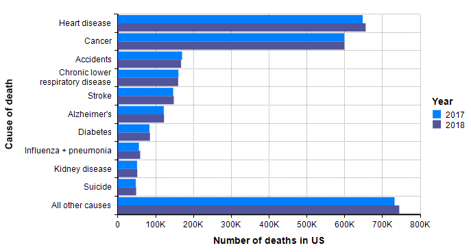
Although not guaranteed, it is a good guess that when a similar graph is created 18 months from now with the data for 2020, and with a separate bar for COVID-19 deaths, the COVID-19 bar fits in with the other bars. In other words, I already have a sense that the bulk of the probability mass for our estimated distribution should land within the range shown in this graph.
Seasonal flu
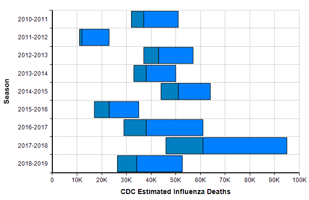
One bar stands out in the above graph, “Influenza + pneumonia” since the COVID-19 virus fits into this category. So we should place extra weight on the base rates for this category. The CDC’s Disease burden of influenza report [CDC20a] goes into more detail about seasonal influenza. Over the past 10 years, the number of deaths in the US from influenza has varied from 12,000 to 61,000.
The CDC’s disease burden report also contains highly relevant data about the number of cases, medical visits, and hospitalizations, which I encourage you to review. Using the reported uncertainties for the past ten years depicted in the previous graph, I merged these into a single mixture distribution and plotted the resulting exceedance probability curve here:
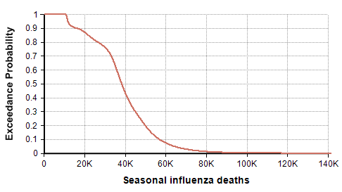
For completeness, I generated this plot using the Analytica expression
UncertainLMH( L,M,H, pLow:2.5% )[Season=ChanceDist(1,Season)]
after creating an index named Season (defined as Local Y:=2010..2018 Do Y&"-"&(Y+1) ), and tables L, M, and H indexed by season and populated with the CDC data depicted in the previous graph. This turns each CDC bar into a distribution, then composes an equally weighted mixture distribution from those. I then showed the result and selected the Exceedance probability view that is new in Analytica 5.4.
Previous pandemics
The next source for relevant base rate data comes from other pandemic outbreaks, especially the three great pandemics of the 20th century [K06] — the Spanish flu pandemic of 1918 [EB20a][TM16], the Asian flu pandemic of 1957 [EB20b][CDC19a], and the Hong Kong flu pandemic of 1968 [EB20c]. In this century, there was a significant H1N1 flu pandemic in 2009 [CDC10],[CDC20c]. In addition, there are two previous Coronavirus outbreaks (but not COVID-19): The SARS-CoV outbreak in 2003 [EA20] and the MERS-CoV outbreak that started in 2012 [WHO19].
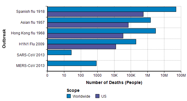
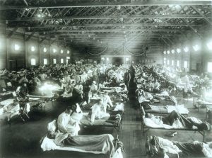
The Spanish flu pandemic of 1918 has been called “the mother of all pandemics” [TM16], with estimates ranging from 25 million to a staggering 100 million deaths worldwide. In the United States, it caused about 550,000 deaths [Br20a]. Please compare this number to the previous graph, where I observe that this number is about the same as the annual number of deaths from either heart disease or from cancer and about one order of magnitude greater than the base rate for flu and pneumonia showed on that graph. It is notable that this epidemic occurred before the modern age of virology.
The Asian flu pandemic started in Singapore in early 1957, then spread rapidly through China in the first few months and reached the US in mid-summer of 1957. Worldwide it caused 1-2 million deaths. By March 1958, it had caused 69,800 deaths in the US [Br20b].
The Hong Kong flu originated in China in 1968 and persisted in early 1970, with 1-4 million deaths worldwide [Br20c]. It was brought back to California by soldiers returning from Vietnam and killed 33,800 people in the US [P20]. I was surprised to read that in 2 weeks after its emergence in Hong Kong, there had been 500,000 cases reported. In comparison, 2 weeks after the emergence of COVID-19 there were 45 confirmed cases, and 9 weeks after there were less than 100,000 cases.
A new strain of H1N1 flu was first spotted in Veracruz, Mexico [Wi20b] reached the US in April 2009 [CDC09] and quickly spread throughout the world. The US and other countries mounted an exceptionally fast and strong response. As a novel strain, it wasn’t covered by the flu vaccine in that first year, but most people over 60 seemed to already have antibodies so that 80% of global deaths were among people under 65 years old [CDC09]. In the first year, there were 61 million cases and 12,470 deaths in the US. Worldwide, it is estimated that 11-21% of the population contracted it, but with a low fatality rate, 151K-575K deaths globally.
A type of coronavirus causes the common cold, so coronavirus “outbreaks” have been with us regularly for a long time. The first threatening coronavirus outbreak occurred with the SARS-CoV pandemic of 2013 [EA20], originating in Guangdong province, China. Like COVID-19, it causes death via acute respiratory syndrome [S20]. The outbreak resulted in 8000 diagnosed cases and 700 deaths worldwide, with 27 cases in the US and no deaths [Wi20].
Another type of coronavirus, MERS-CoV, emerged in the middle east in Sept 2012 and continues to the present day, with notable outbreaks in Saudi Arabia in late 2013 and Korea in 2015. As of Nov 2019, there have been 2494 confirmed cases and 858 deaths [WHO19]. The mortality rate (34%) is shockingly high. Only 2 of the cases and no deaths have been in the US.
The base rate distribution
I am ready to synthesize the above information to come up with a first estimate (as a probability distribution, of course) based only on base rate data. This will be my starting point, and then I will adjust it based on other knowledge sources specific to COVID-19.
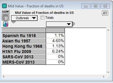
I’ll start with the 25th and 75th percentiles. The 25th percentile in the seasonal influenza death distribution show earlier (based on 2010-2019 data) is 30,900 and the 75th percentile is 47,500. Where do the number of US deaths in the past pandemics land on this distribution? The Spanish flu of 1918 is beyond the 99.9999th percentile, making it a true black swan [T10]. The Asian flu of 1957 is at the 97th percentile. The Hong Kong flu of 1968 is at the 32nd percentile. The H1N1 flu of 2009 is at the 6th percentile. And the SARS-CoV and MERS-CoV outbreaks are at the zeroth percentile since there were no deaths from either in the US. We need to also take into account that the flu burden graph is a sum of many strains of influenza, whereas the pandemic numbers are individual numbers.
From there, I settled on the 25th percentile of 25,000 and the 75th percentile of 80,000 for my base rate distribution.
Next, I turn to the (right) tail estimation. Here the Spanish flu of 1918 is the best data point we have, but it is also limited in many ways in terms of how similar it really is to our modern situation. It is useful for identifying an “extremely dire” outcome, 1 in a 100-year event. Conveniently, it occurred 102 years ago. There is only a single data point, so we don’t really know if this is representative of a 1 in 100-year event, but I have to go with what I have while trying to minimize too much inadvertent injection of “expert knowledge”. So, I use 550,000 deaths as my 99th percentile. With leaves me with the following estimated percentiles for my base-rate distribution:
| Percentile | Base rate for deaths in US in 2020 |
| 0 | 22 |
| 25 | 25,000 |
| 75 | 75,000 |
| 99 | 550,000 |
I promise it is pure coincidence that my 25th and 75th percentiles came out to be 25,000 and 75,000. I only noticed that coincidence when creating the above table. Thanks to the recently introduced Keelin (MetaLog) distribution [K16], it is easy to obtain a full distribution from the above estimates supplying the table to the CumKeelinInv function in Analytica, which yielded the following exceedance curve.
A log-log depiction of the same distribution is also useful for viewing the extreme tail probabilities:

The probability density plot on a log-X axis is as follows:

Incorporating COVID-19 specifics
The next step is to use actual information that is specific to COVID-19 and its progression to date to adjust my base-rate distribution. The base-rate distribution is now my anchor. I view anchoring as an undesirable bias, but also as an unavoidable limitation of the way our minds work. But the benefit is that this helps to anchor me in actual probabilities rather than in degree of effect, story coherence, ease of recall, and so on.
There are many ways to approach this: trend extrapolation, several back-of-the-envelope decompositions, and many epidemiological models from the very simple to very complex. Forecasts are typically improved if you can incorporate insights from multiple approaches.
Trends
The Worldometer.info website [W20] has been tracking the daily progression of reported cases and deaths. Early in the outbreak, on 1-Feb-2020, I published a blog article examining the scant information about mortality rates that were available at that time [C20]. At that time, I found a nearly perfect fit to exponential growth curves for both the reported cases and reported deaths. From pretty much the day of that posting onward, the trend of both curves has been very much linear, as seen here in the reported deaths up to today.
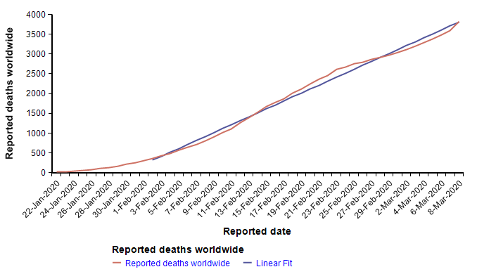
The reported cases follow the same pattern — exponential growth to 1-Feb, and linear growth for the subsequent five weeks to the present. I find linear growth of either curve hard to explain since disease transmission is an intrinsically geometric process in the early stages. There is one obvious explanation for the linear growth of the reported cases, which is that the infrastructure for detecting and reporting cases, being a human bottleneck, can’t keep up with exponential growth, so it makes sense for reporting to grow linearly after some point. If that were the case, it would mean that the fraction of cases actually reported would be shrinking fast. But I’m somewhat skeptical that the reporting of deaths would be hitting up against such a bottleneck, so I have to take the linearity of the reported deaths in February as real.
A linear extrapolation of the reported deaths to the end of the year predicts a total of 33,640 deaths worldwide. What fraction of those would occur in the US? Rough ratios for past pandemics are shown here
So if by the end of the year, a pessimistic 5% of all deaths occur in the US, the predicted number in the US would be 1,682, which is at the 0.002th quantile (i.e., 0.2 percentile) of the base-rate distribution, suggesting that the left side of the distribution should be adjusted downward. I don’t know whether the linear trend will continue. Because transmission is a geometric process, I am not optimistic, but since it is happening, I have to consider it a realistic possibility. Adjustment: 10th percentile = 1500.
Maximally simplistic models
I like to decompose difficult estimation problems into other variables that can be estimated in their own right. I refer to this as “model building” and I’ve spent the last 20 years designing the ideal software tool to assist critical thinkers with this process (i.e., the Analytica visual modeling software). The famous physicist, Enrico Fermi, was denounced for, among other things, emphasizing this style of problem-solving to his students, and I’ve seen it called “Fermi-izatng” [TG15]. With the right tools, the building of large models is simply the recursive application of “Fermi-ization” to the sub-components of your model, over and over.
There are few things as helpful for gaining insight into forecasts like these as building models. However, the degree to which it is helpful really depends critically on the software you use, especially as models expand, as they invariably do. You can build models in spreadsheets, and you can implement models in Python, but I’ve learned that both of these extremes are pretty ineffective. Yes, you can burn a lot of time and experience the satisfaction of surmounting many tough technical challenges, but much of the good insight gets obscured in the tedious mechanics and complexity of the spreadsheet or in the code of Python. I use Python quite a lot and consider myself to be at the top tier among Python users, but I don’t find it useful for this type of work.
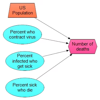
Don’t discount the simplest models, but don’t stop with them either. Here is simplest model I could come up with
- 330M people in US
- p1 percent of population contract virus
- p2 percent of those get sick
- p3 percent of those die
I’ve just replaced the original assessment problem with three new ones. Once you have these, you can just multiply the four numbers together. When you assess p1, p2 and p3, you can use distribution (even quick and dirty) for them as well, and then use, for example, Monte Carlo sampling to propagate the uncertainty. The model itself looks like this:
What makes this especially useful is not a single prediction in produces, but rather that you can experiment with a lot of different scenarios. For example, one scenario I’ve heard suggested repeatedly (which may or may not have any merit — which is something I am going to judge) is that the virus has already substantially spread through the population, so that many people are carrying it, but most people don’t develop symptoms. The claim is that our current sampling of reported cases has come from the small percentage of people that actually get sick. So, high-rates of infection in the population, low percentage of sick:
- p1 = 20%
- p2 = 2%
- p3 = 2%
- Number of deaths = 24K
A pitfall is that when you plug in single numbers for each estimated quantity, as I just did in his example, it is easy to be greatly misled [S12]. Let’s repeat the same scenario with distributions centered on these values, to at least incorporate a little uncertainty.
- p1 = UncertainLMH(10%, 20%, 30%, lb:0,ub:1)
- p2 = UncertainLMH( 1%, 2%, 3%, lb:0, ub:1)
- p3 = UncertainLMH(0.5%, 1.5%, 3%, lb:0, ub:1)
Which results in the following exceedance probability graph

The median is now only 16,600, but the graph shows a 1% chance of exceeding 100K deaths. Although it shows as an unlikely (1%) outcome, it is the information that is most relevant for planning and decision making, which gets missed entirely if you don’t explicitly include uncertainty. Now we can ask how the exceedance curve changes as our estimate for the percentage of people who don’t get sick varies. In the first scenario, we looked at the case the vast majority of people (roughly 98%) show no symptoms. What if more people show symptoms, and then the same percentage of those get sick? I added a variable, Est_Prob_nosick, to hold the “Estimated percentage who don’t get sick”, and (re)defined
- Est_prob_nosick :=
[ 2%, 5%, 10%, 25%, 50% ] - p2 =
Localp:=Est_percent_nosick Do UncertainLMH( P/2, P, 3*P/2, lb:0, ub:1)
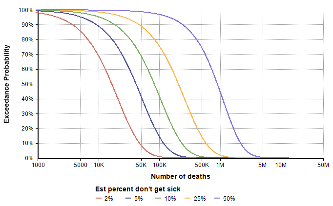
The direst scenario on this graph corresponds to the case where roughly 20% of the population contracts the virus, roughly 50% of those who contract it show symptoms, and roughly 1.5% of those who show symptoms end up dying by the end of the year. This strikes me as a pretty low probability scenario, but not entirely far fetched. The base-rate distribution assigns a 1% chance of exceeding 500,000 deaths, whereas the direst curve here assigns a 75% chance, with a 45% chance of exceeding 1M. My takeaway from this is that we need to extend the right tail of the base-rate distribution somewhat, such as moving the 98th percentile to around 1M. However, I’m prepared to adjust that again after additional modeling exercises.
Dynamic models (the SIR-like model)
A dynamic model explores how the future unfolds over time. It makes use of rates, such as the rate at which an infection spreads from person to person, to simulate (with uncertainty) how the number of infected and recovered people evolves over time.
I put together a simplistic dynamic model, and made it available open-source (see below), as shown in this influence diagram
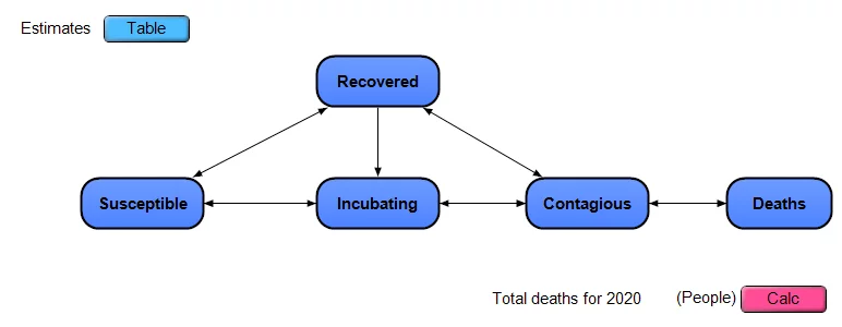
The model approximates the US as a closed system, with a certain number of people in each of the 5 stages, any one person is in a single stage on any given day. People move from being Susceptible to Incubating (infected but non-contagious) to Contagious to Recovered. Deaths occur only among those in the Contagious stage. There is no compartmentalization by age, geography or other criteria. Each of the dark blue nodes with heavy borders in the diagram is a module node, and each contains its own sub-model inside.
Note: This is a simple extension of a classic SIR model, which stands for Susceptible to Infectious to Recovered. I’ve split the “I” stage in SIR into the two stages of Incubating and Contagious. I’ve also added explicit modeling of uncertainty.
At the top left, there is an edit table where you can enter your own estimates for the uncertain inputs.
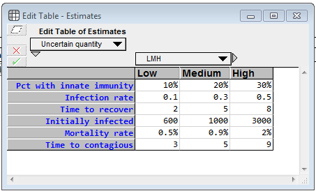
For each uncertainty, you specify a low, medium and high value, which becomes 10-50-90 percentile estimates. Pct with innate immunity is the percentage of the population who will never become contagious (and will never die from infection). For whatever unknown reason, they are innately immune. (I totally invented these numbers) The Infection rate denotes how many people, on average, a contagious person infects per day, when the entire population other than that population is susceptible. The Time to recover is the average number of days that a contagious person remains contagious. Initially infected is the number of people who are infected (either incubating or infected) as of 8-Mar-2020 (the day I created the model), whether or not they’ve been officially diagnosed, and the Mortality rate is the percentage of contagious people who die from it. The model assumes the death happens while in the contagious phase. Time to contagious is the number of days a person spends in the incubation period. I emphasize again that the real power of a model like this is not the output of a single run, but rather that it enables you to gain a deeper understanding of the problem by interacting with it, exploring how different estimates change the behavior, etc.
The following chart shows the mean values for the key stock variables of the model. The dynamic nature of the model through time becomes evident when you notice that the X-axis is Time.
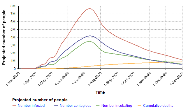
I want to emphasize that you should not fixate on the specific projection depicted here since it is simply the mean projection based on the estimates for chance inputs shown above. The real insight comes from interacting with the model, changing inputs and exploring different views. Rather than reproduce many cases here, I will instead summarize some of the insights I got after playing with the model for quite a long time.
The largest surprise for me was how extremely heavy the right tail tended to be (the statistical term for this is leptokurtic). In the above simulation, the distribution for total deaths in 2020 has a kurtosis of 54. This is so unusual that I spent quite a bit of time debugging, trying to figure out what was going wrong, but eventually satisfied myself it was working right. To give you a sense of how extreme this is, consider this. The number of deaths in 2020 variable, the model’s key output, had a median of 401 deaths, a mean of 881,000, and a 95th percentile of 3.7M. The source for this comes from the amplification power of geometric growth. With my uncertain inputs, a large number of Monte Carlo scenarios died down quickly — in nearly 50 percent of them the disease died down before taking the lives of 400 people. But in the ones having a transmission factor (= infection rate times time to recover) greater than 1, the number of people infected took off very quickly, in the 95th percentile simulations.
Here is a probability bands graph for the percentage of the population who become infected at some point on or before the indicated date.
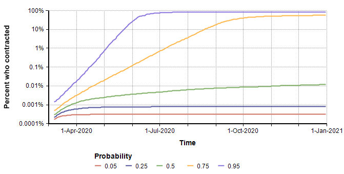
In the median case, the percentage of people who contract it stays extremely low, but in the 75th percentile case (and above), everyone catches it. This radical difference is due to the high kurtosis that occurs from the exponential growth in the pessimistic cases.
Interestingly, the surge in July that appears to be predicted in the graph of the mean of “Projected number of people” (two plots previous) is somewhat of an artifact. The surge occurs only in the most pessimistic cases, such as the 95th percentile where the entire population reaches saturation near the beginning of July. The numbers of infected in those few outliers are so large they dominate the average, causing it to appear that the model predicts a surge in July when viewing the mean.
Obtaining a copy of the SICR model
I made this model available for free and open-source to encourage anyone interested to play with, modify and enhance it.
To run it:
- Install Analytica Free 101 (if you don’t already have Analytica installed)
Recommended: Since exceedance plots are nice with this model, if you are an Analytica subscriber, use Analytica 5.4 beta instead. - Download the model
- Launch analytica and open the model.
- If you are a newbie to Analytica, consider going through at least the first few chapters of the Analytica Tutorial to learn your way around.
Insights from the dynamic model
I did not find the dynamic model to be very helpful for obtaining meaningful predictions of real numbers. The predictions it makes are hyper-sensitive to the uncertain inputs, especially those inputs like infection rate and time to recover (which is the number of days infectious). Minuscule changes to those create dramatic swings in the numeric forecasts. For these purposes, the simplified models were far more useful.
However, the dynamic model gave me an appreciation for just how heavy that right tail can be. Earlier in this article, I noted that the Spanish flu was at the 99.9999% of my base-rate distribution. The dynamic model has convinced me that it should not be. It doesn’t take much to swing the dynamic model into forecasting an ultra-dire scenario.
But on the upside, the ultra-sensitivity of outcome of infection rate and mortality means that every precaution we take as a society has an amplified beneficial effect. So even the things that seem stupid and minor reduce the risk of the dire outcomes far more than my intuition would suggest. However, my treatment in this article is not dealing with social policy decisions.
Incorporating modeling insights
After incorporating the insights from the trends and models discussed in the text, I have revised my percentile assessments as follows to obtain the final forecast.
| Percentile | Base rate for deaths in US in 2020 |
| 0 | 22 |
| 10 | 1500 |
| 25 | 15,000 |
| 75 | 75,000 |
| 95 | 550,000 |
| 99 | 2M |
I show the plots of the full distribution in the Result section next. The quantile estimates in the preceding table are expanded to a full distribution using a semi-bounded Keelin (MetaLog) distribution [K16].
Results
In this section, I summarize my forecast for the Number of Deaths from the COVID-19 Coronavirus that will occur in the US in the year 2020. For those who have jumped directly to this section, I have documented the information and process that has gone into these estimates in the text prior to this section.
I can’t emphasize enough how important it is to pass these estimates around in the form of a probability distribution, and NOT convert what you see here to just a single number. If you are a journalist who is relaying these results to lay audiences, at least communicate the ranges in some form.
The following exceedance probability graph sums up the forecast, and I’ll explain how to interpret it following the plot.
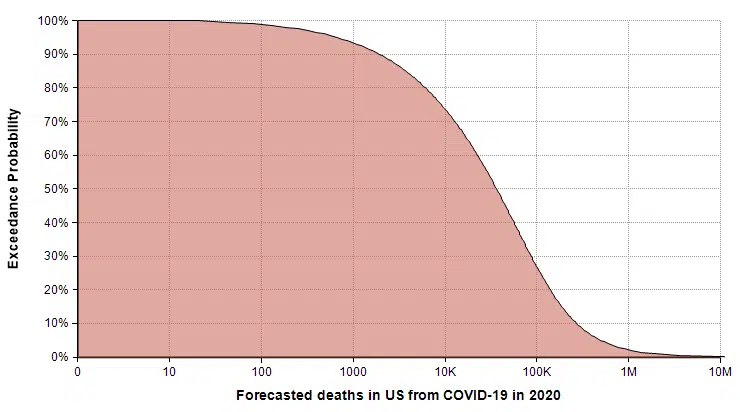
The actual number of deaths has an equal chance of being less than or greater than the median value, making the median the “most typical” of the possible outcomes. To read the median, find 50% on the vertical axis, and find the corresponding value on the horizontal axis. The median estimate is that 36,447 people will die from COVID-19 in 2020.
The 90% exceedance gives a reasonable “best-case” extreme scenario. The forecast gives a best-case of 1,923 deaths. There is a 10% chance of the actual number being this low.
You can consider the 10% exceedance probability to be the “very pessimistic” scenario. There is a 90% chance it won’t get that bad, but a 10% chance it will be even worse. This 10% exceedance forecast (also called the 90th percentile) is 271,900 deaths.
The right tail corresponding to the part of the graph where exceedance probabilities are less than 10% represents the very unlikely, but not impossible, catastrophic scenarios. I judged the probability of 1 million deaths or more to be 2%, with 2 million or more at 1%. The good news about these extreme cases is that the probability of these extreme scenarios materializing is hyper-sensitive to the parameters that we can influence through changes that lower transmission rates.
Summary
I intended this article to be a tutorial-by-example for how to forecast a very difficult uncertain quantity. The quantity I chose happens to be one of very high interest at the present time (10-March-2020), so as a side effect I hope that the forecast for the specific variable I used is useful in many readers’ immediate decisions and decision-models.
I emphasized that you should always consider a forecasting task to be an assessment of a probability distribution. Forecasting a single number is a flawed enterprise. When you forecast a probability distribution, you can see how well you did, and improve.
Despite all the incredible algorithms, data, and model building tools at our fingertips, forecasting is intrinsically an art. But the approach you take matters a lot. Cognitive biases will lead you astray very easily. Starting your forecasting from your personal expertise about the topic is likely to lead to sub-optimal results. I demonstrated how to start with base rate data first, trying hard to avoid bringing in that expertise until you’ve formed a base rate distribution. Then consider how the parameters of your variable differ from the base rate data and use that to adjust the base rate distribution. Explore trends and the simplest models you can come up with, followed by advanced model building.
Finally, invite other people to critique your forecast. Yes, I’m inviting you to criticize my assessment — constructively, I hope. I’ve taken you through the journey to get to that estimate. At the various subjective decision points in that process, how would you have done it differently? Was your forecast dramatically different?
References
- [A19] Duke, Annie (2018, 2019). “Thinking in bets: making smarter decisions when you don’t have all the facts“, Penguin Random House.
- [A20] “What is Analytica?“, Lumina web site.
- [CJ91] Camerer, Colin F. and Johnson, Eric J. (1991), “The process-performance paradox in expert judgement: How experts know so much and predict so badly?”, in Toward a General Theory of Expertise: Prospects and Limits. Ed. A. Ericson and J. Smith. New York: Cambridge University Press.
- [C20] Chrisman, Lonnie (2020), “The mortality rate of the Wuhan coronavirus“, blog posting on Lumina web site 1-Feb-2020.
- [CDC09] The 2009 H1N1 Pandemic: Summary Highlights, April 2009-April 2010, Centers for Disease Control and Prevention, website.
- [CDC18] Summary of the 2017-2018 Influenza Season, Centers for Disease Control and Prevention, website.
- [CDC19a] 1957-1958 Pandemic (H2N2 virus), Centers for Disease Control and Prevention, website.
- [CDC19b] Kenneth D Kochanek, Sherry L. Murphy, Jiaquan Xu, and Elizabeth Arias (2019), Deaths: Final data for 2017, National Vital Statistical Reports 68(9), U.S. Department of Health and Human Services, CDC.
- [CDC20a] Disease burden of Influenza, Center for Disease Control and Prevention, website.
- [CDC20b] Mortality in the United States, 2018, Center for Disease Control and Prevention, website.
- [CDC20c] 2009 H1N1 Pandemic (H1N1pdm09 virus), Center for Disease Control and Prevention, website.
- [EB20a] Editors of Enc. Brit. (updated 4 Mar 2020), Influenza pandemic of 1918–19, Encyclopedia Britannica.
- [EB20b] Kara Rogers, Asian flu of 1957 – Pandemic, Encyclopedia Britannica.
- [EB20c] Kara Rogers, Hong Kong flu of 1968 – Pandemic, Encyclopedia Britannica.
- [EA20] Robert Kessler, SARS: The First Pandemic of the 21st Century, EcoHealth Alliance, website.
- [FTE16] Nat Silver, “Who will win the presidency: 2016 Election forecast“, FiveThirtyEight website.
- [FR06] “Frank P. Ramsey Medal: Past awardees“, Decision Analysis society, Informs website.
- [H88] Howard, Ronald A.,’ (1988). “Decision Analysis: Practice and promise”, Management Science 34(6):679-695. doi:10.1287/mnsc.34.6.679. JSTOR 2632123.
- [K06] Kilbourne, Edwin D., “Influenza Pandemics of the 20th Century“, Emerging Infectious Diseases EID Journal, 12(1), Jan 2006. Reproduced on CDC website.
- [K11] Daniel Kahneman (2011), Thinking fast and slow, Farrah, Straus and Giroux, NY.
- [K16] Thomas W. Keelin (Nov. 2016), “The Metalog Distribution“, Decision Analysis, 13(4):243-277.
- [K87] Keren, Gidion (1987), “Facing uncertainty in the game of bridge: A calibration study“, Organizational Behavior and Human Decision Processes 39(1):98-114.
- [MFB12], McBride, Merissa F, Fidler, Fiona, Burgman, Mark A. (2012), “Evaluating the accuracy and calibration of expert predictions under uncertainty: predicting the outcomes of ecological research”, Biodiversity Research 18(8):782-794
- [MH90] M. Granger Morgan and Max Henrion (1990), Uncertainty: A guide to dealing with uncertainty in quantitative risk and policy analysis, book.
- [NS20] Genomic epidemiology of novel coronavirus (hCoV-19), NextStrain.org.
- [P20] Pandemics and Pandemic Threats since 1900, PandemicFlu.gov
- [S12] Savage, Sam, “The Flaw of Averages: Why We Underestimate Risk in the Face of Uncertainty“, book.
- [S20] Dr. Seheult, pulmonologist, “How Coronavirus causes fatalities from acute respiratory distress syndrome (ARDS)“, MedCram.com, video on youtube.
- [T10] Taleb, Nassim Nicholas (2010), “The black swan: The impact of the highly improbable,” Penguin, London.
- [TG15] Totlock, Philip E. and Gardner (2015), Dan, “Superforecasting: The art and science of prediction”, Crown Publishers, NY.
- [TK74] Tversky, A.; Kahneman, D. (1974). “Judgment under Uncertainty: Heuristicsand Biases” (PDF). Science. 185 (4157): 1124–1131.
- [TM16] Taubenberger JK, Morens DM. (2016) “1918 influenza: the mother of all pandemics“. Emerging Infection Disease 12:15-22.
- [W20] Worldometer.info, COVID-19 Coronavirus outbreak website
- [WHO19] World Health Organization, Middle East respiratory syndrome coronavirus (MERS-CoV) Monthly summary, Nov 2019.
- [WHO20] World Health Organization, SARS (Severe Acute Respiratory Syndrome, on website.
- [Wi20] Severe acute respiratory syndrome, Wikipedia.org
- [Wi20b] 2009 flu pandemic, Wikipedia.org